Drink Label Design for a Non-Alcoholic Cocktail Concept
AQU
Mediterranean cocktail hour, minus the alcohol. We designed the brand and drink labels for this sunny concept.
What we did
Brand Identity Packaging Design
Industry
Beverage
How do you make a zero-proof cocktail feel like a celebration?
Non-alcoholic drinks have earned a real seat at the table, and people choosing them still want the flavor, ritual, and sense of occasion that come with a good cocktail. AQU imagines a non-alcoholic buzz cocktail inspired by Mediterranean ingredients and the easy, social lifestyle that goes with them: botanicals, citrus, and herbs made for long evenings with friends.
AQU is a concept we created at JanesHaus, a boutique creative agency in Los Angeles, to explore one question: how can a zero-proof drink feel like a real cocktail, not a substitute? We started by picturing the moment it belongs to, a long Mediterranean evening with friends, then built a custom brandboard around that feeling before designing a drink label for each flavor.
Sun, Sea, and Zero Proof
The idea behind AQU was simple: a Mediterranean aperitivo in a bottle, without the alcohol. The drinks are imagined as refreshing and uplifting, balancing botanicals, citrus, and herbal notes for something more grown-up than a soda.
That set the creative challenge. The brand had to feel fun enough for a night out and polished enough to sit next to premium spirits, while making it clear this is a new kind of social drink for people who want the ritual without the hangover.
Setting the Mood Board
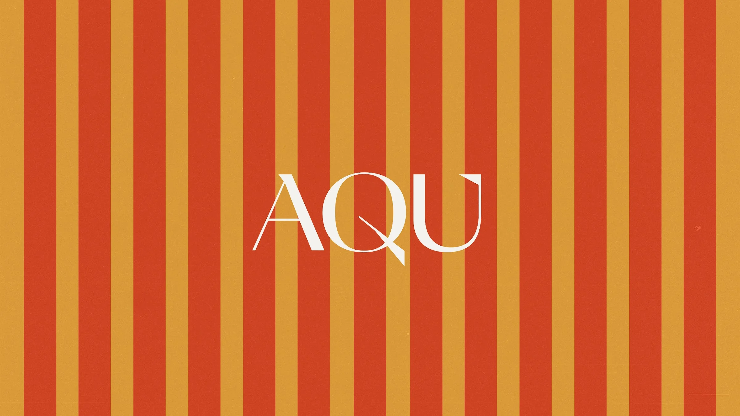
We started with a custom brandboard that set the colors, type, and overall look before we designed any labels. Palm trees, beach towel stripes, and warm Mediterranean colors give the brand its personality: effortless style, relaxed vibes, and coastal charm, with clean type keeping it grown-up.
Getting that right first meant every piece, from the logo to the label, looks like it belongs to the same brand.
Bottled Sunshine
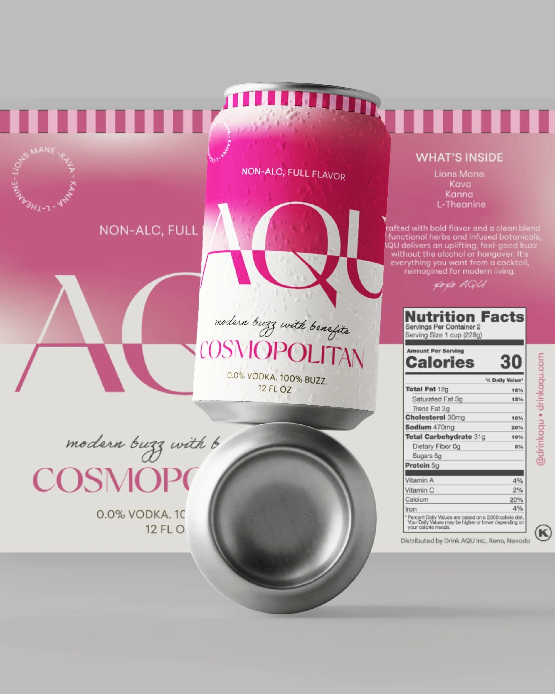
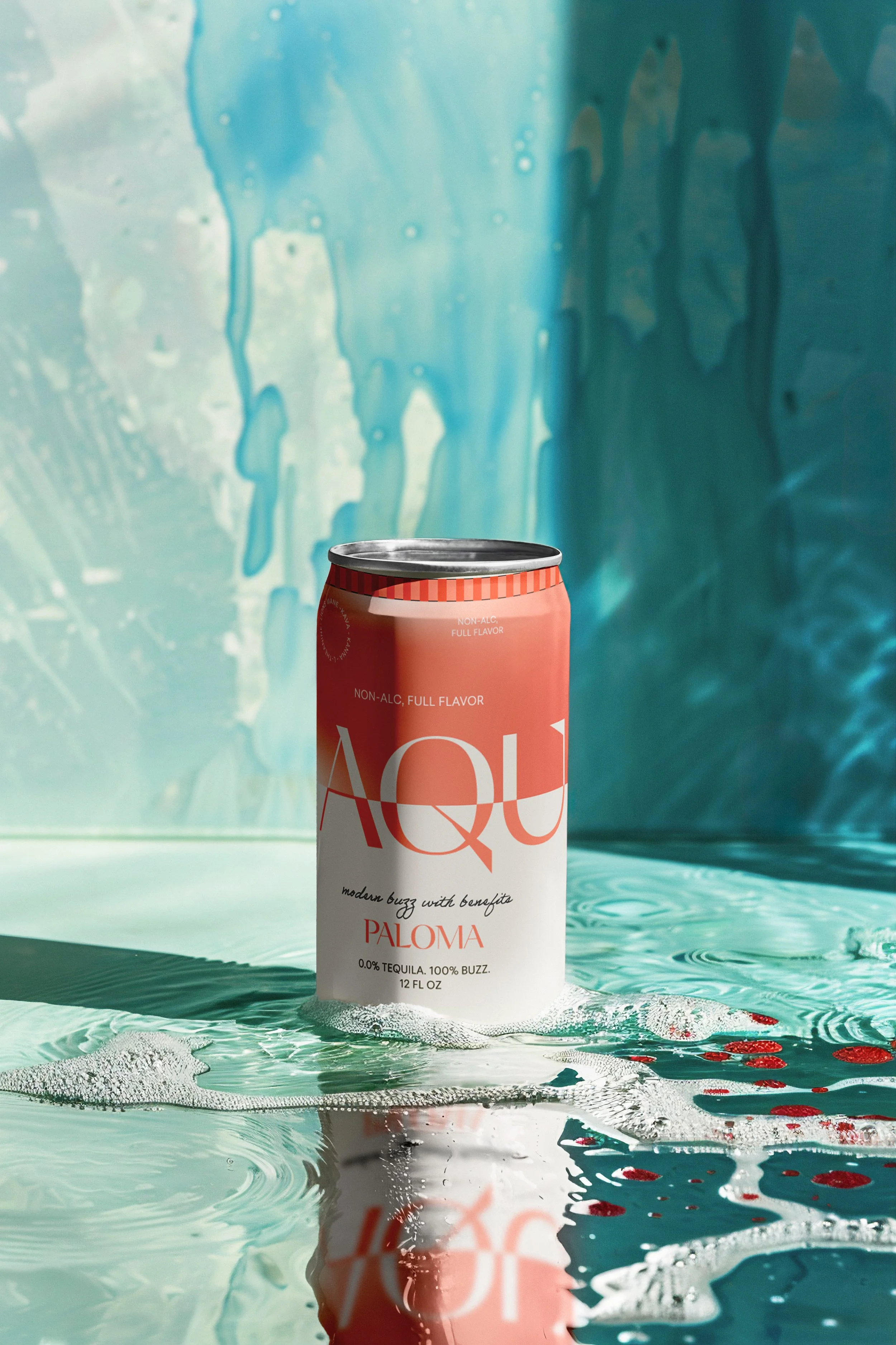
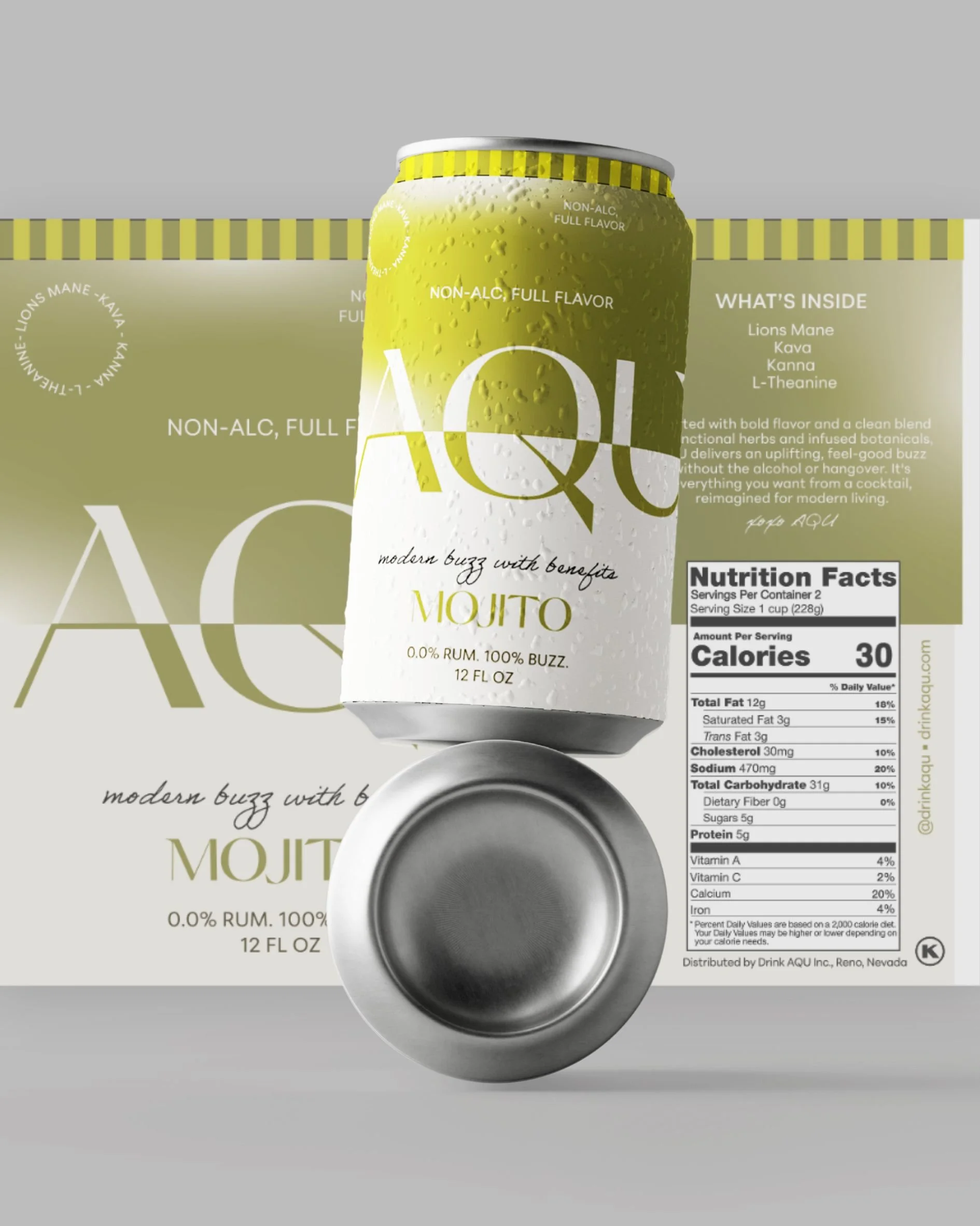
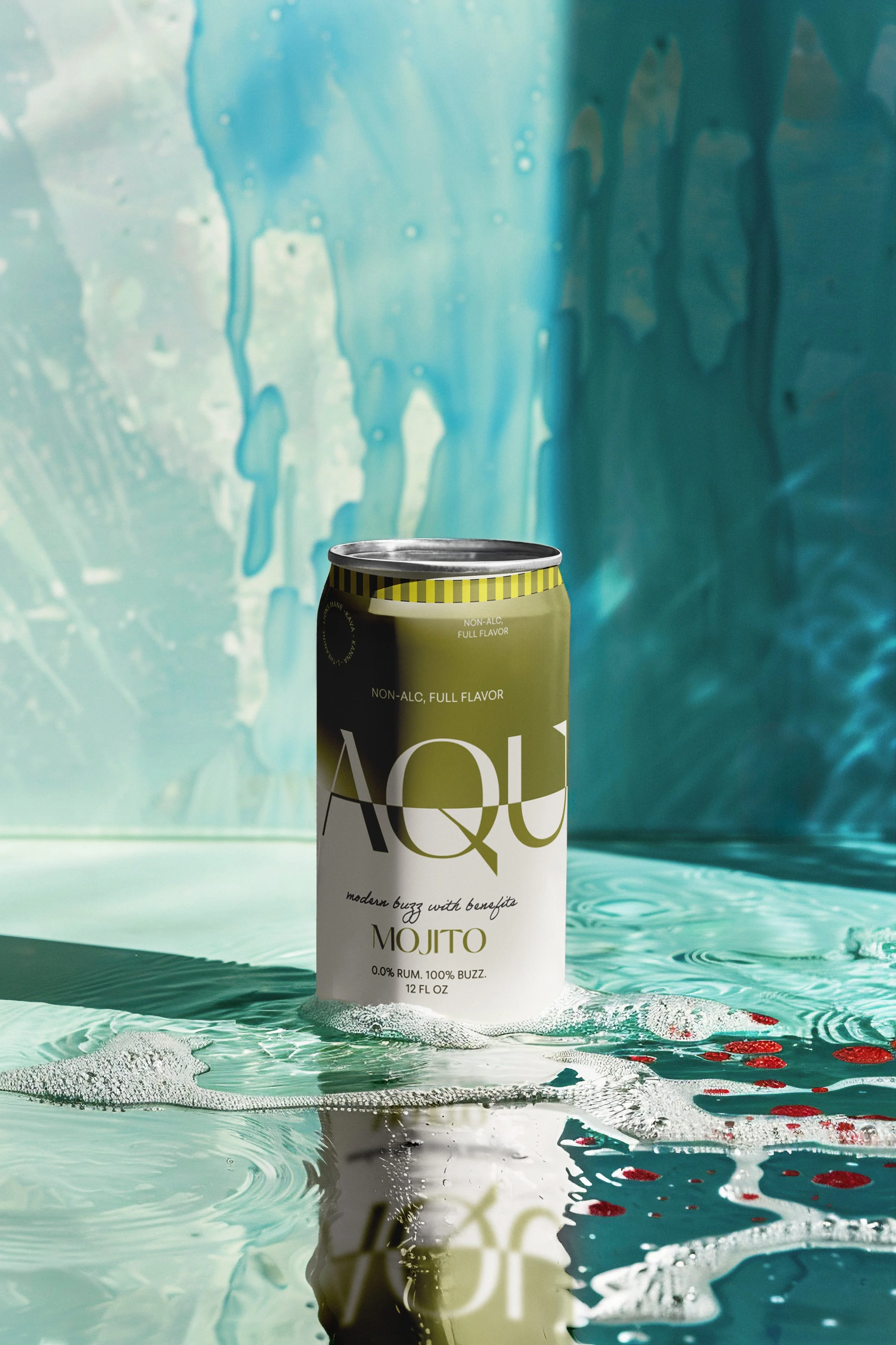
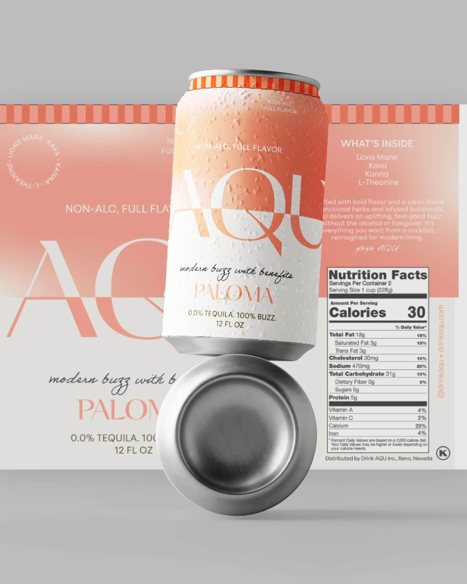
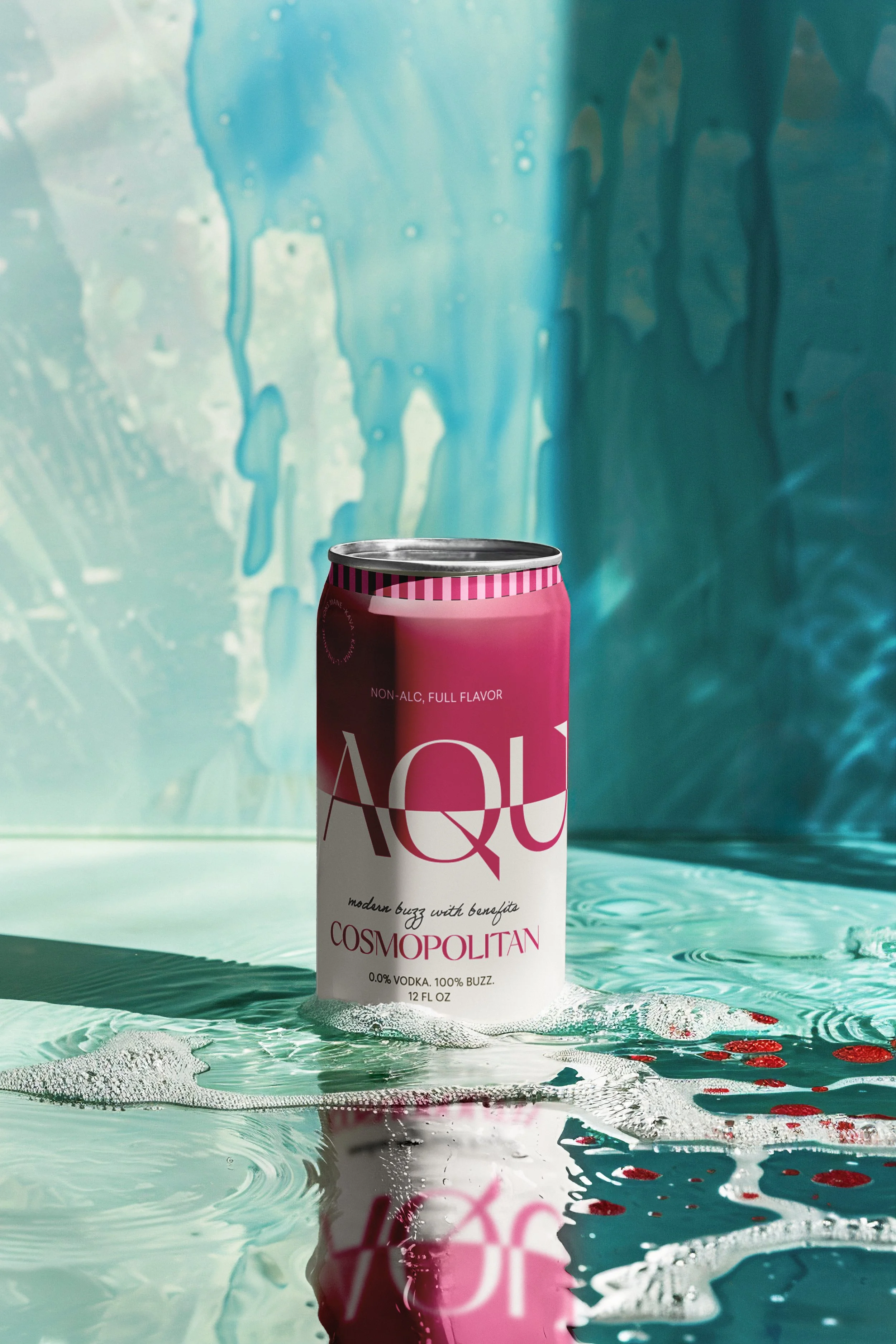
For the packaging, we translated the brandboard into labels for three zero-proof cocktails: a Paloma, a Cosmopolitan, and a Mojito. Each one gets its own color story within the system, so shoppers can spot their favorite at a glance while the range still reads as one family.
Good drink label design has to work in a split second. AQU's labels use bright color and a clear layout, so shoppers get the idea, fresh and made for celebrating, before they read a word.
A Round for Every Flavor
A flavor system is only as good as its ability to grow. We designed AQU's packaging so new flavors can slot in easily, each with its own accent color and motif, while the core layout, logo, and typography stay consistent.
That gives the brand room to try seasonal drinks or limited releases without losing its identity, and keeps it consistent across shelves, menus, and social feeds.
Raise a Glass
AQU shows that a non-alcoholic cocktail brand can look just as fun as the real thing, with a Mediterranean-inspired identity and labels made to stand out on a shelf.
Drink Label Design FAQPour Over the Details
What drink label design ideas boost product sales?
Drink label design is the creative work behind the label on a can or bottle: the color, typography, imagery, and required details that tell shoppers what a drink is and why they should pick it up. Ideas that tend to work include a bold signature color, a clear flavor name, and one memorable visual hook that makes the label easy to recognize again.
What are the essential elements of a successful drink label?
A strong label needs a clear brand name, an easy-to-read flavor or product name, and a visual style that matches the drink's personality. It also has to fit the required information neatly, which is why AQU's layout keeps a consistent structure across every flavor.
How do you create a professional drink label for a new beverage?
Start with a brand foundation, such as a brandboard that sets the colors, type, and visual language, then design the label within that system. For our AQU concept, the brandboard came first, so every label felt like part of the same Mediterranean world.
How do you make a drink label stand out on store shelves?
Use strong contrast, a clear hierarchy, and a color story that reads from across the aisle. AQU gives each flavor its own accent color while the logo and layout stay consistent, so single bottles pop and the full range reads as one family.
How do you design a drink label that complies with FDA regulations?
Most non-alcoholic drinks need a product name, net contents, an ingredient list, a Nutrition Facts panel, allergen information, and the maker's or distributor's details. Plan space for these early in the design, and have a compliance expert review the final label before printing.
How do you choose the right label material for different drink types?
Think about where the drink will live: coolers and ice buckets call for water-resistant films, while shelf-stable bottles can use paper stocks with a premium texture. The container matters too, since glass, aluminum, and plastic each pair best with different materials and adhesives.
What materials are best for waterproof beverage labels?
Synthetic films such as BOPP and vinyl hold up well to condensation and ice, especially with a protective laminate or varnish. For a premium feel, some brands use treated wet-strength papers that resist moisture while keeping a natural texture.
Which services offer eco-friendly drink label printing?
Many label printers now offer recycled or tree-free papers, compostable films, and water-based inks. Ask how each option affects the recyclability of your bottle or can, since the label and container need to work together.
How do you find inspiration from popular drink label designs?
Study the labels you love and note what makes them work, then look beyond the drinks aisle to travel, architecture, fashion, and nature. AQU drew on palm trees, beach towel stripes, and warm Mediterranean color for a relaxed, coastal feel that's fresh rather than borrowed.
Which agencies offer branding services for new beverage products?
Look for agencies with beverage work in their portfolio and experience taking a drink from identity to packaging. JanesHaus, a boutique creative agency in Los Angeles, designs branding, packaging, websites, and visuals for beverage and CPG brands.
















ready to build your Haus?
Launching something new or giving your brand a refresh? JanesHaus creates branding, packaging, and websites built to stand out on shelves and screens.