Kombucha Label Design for a Hard Kombucha Brand
Boochcraft
Organic hard kombucha from San Diego. Our creative director, Jane Miller, designed the packaging for three flavors in its 2026 Liquid Art Lab series.

What we did
Packaging Design 3D Rendering 3D Animation
Industry
Beverage
Location
San Diego, CA
Photography
Ruth Kim (@ruthkimcreative)
How do you dress a cocktail-inspired kombucha for a can that doubles as a canvas?
Hard kombucha has earned its spot in the cooler, and Boochcraft helped put it there. The San Diego brand brews organic hard kombucha with fresh-pressed juice and freshly steeped tea. Its Liquid Art Lab series gives the brew team room to experiment with new flavors while a different artist turns each can into a canvas.
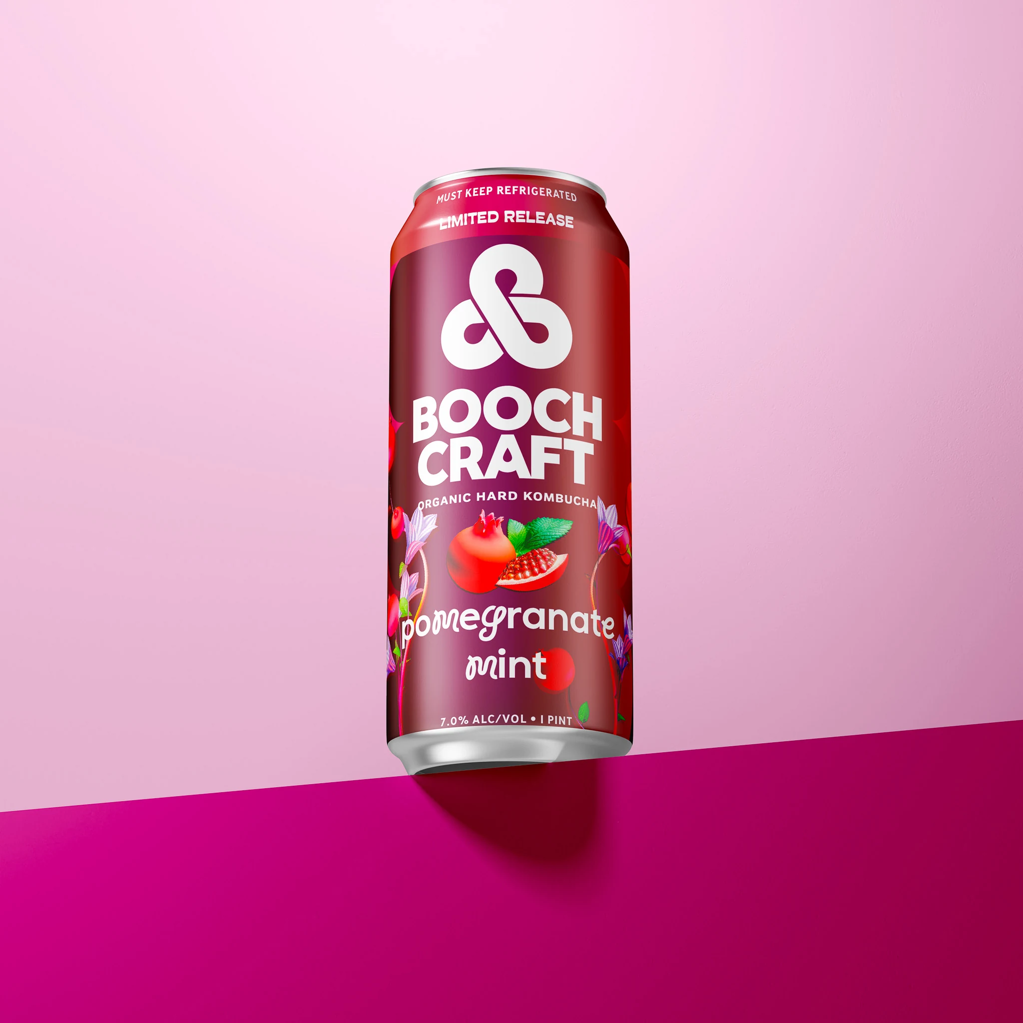
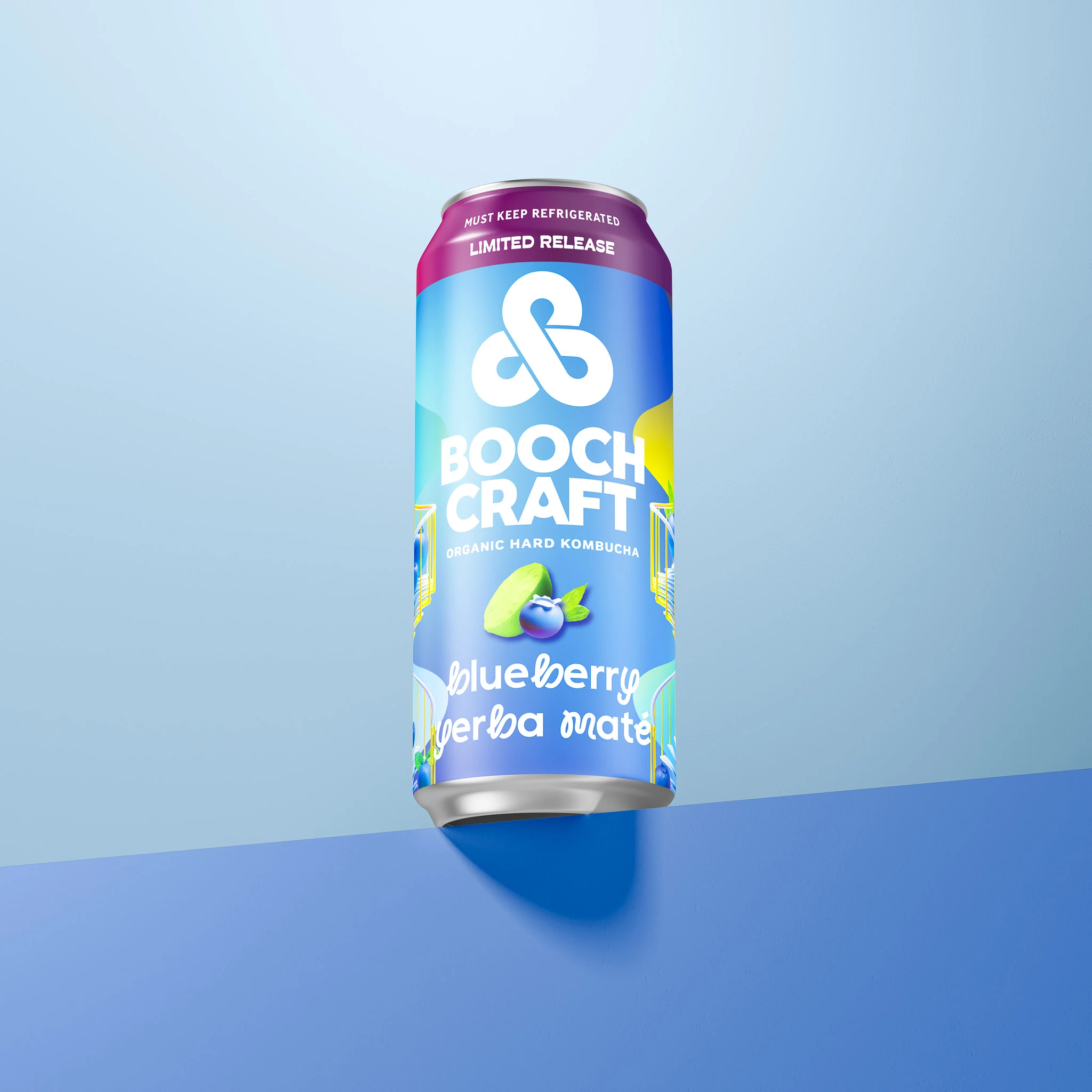
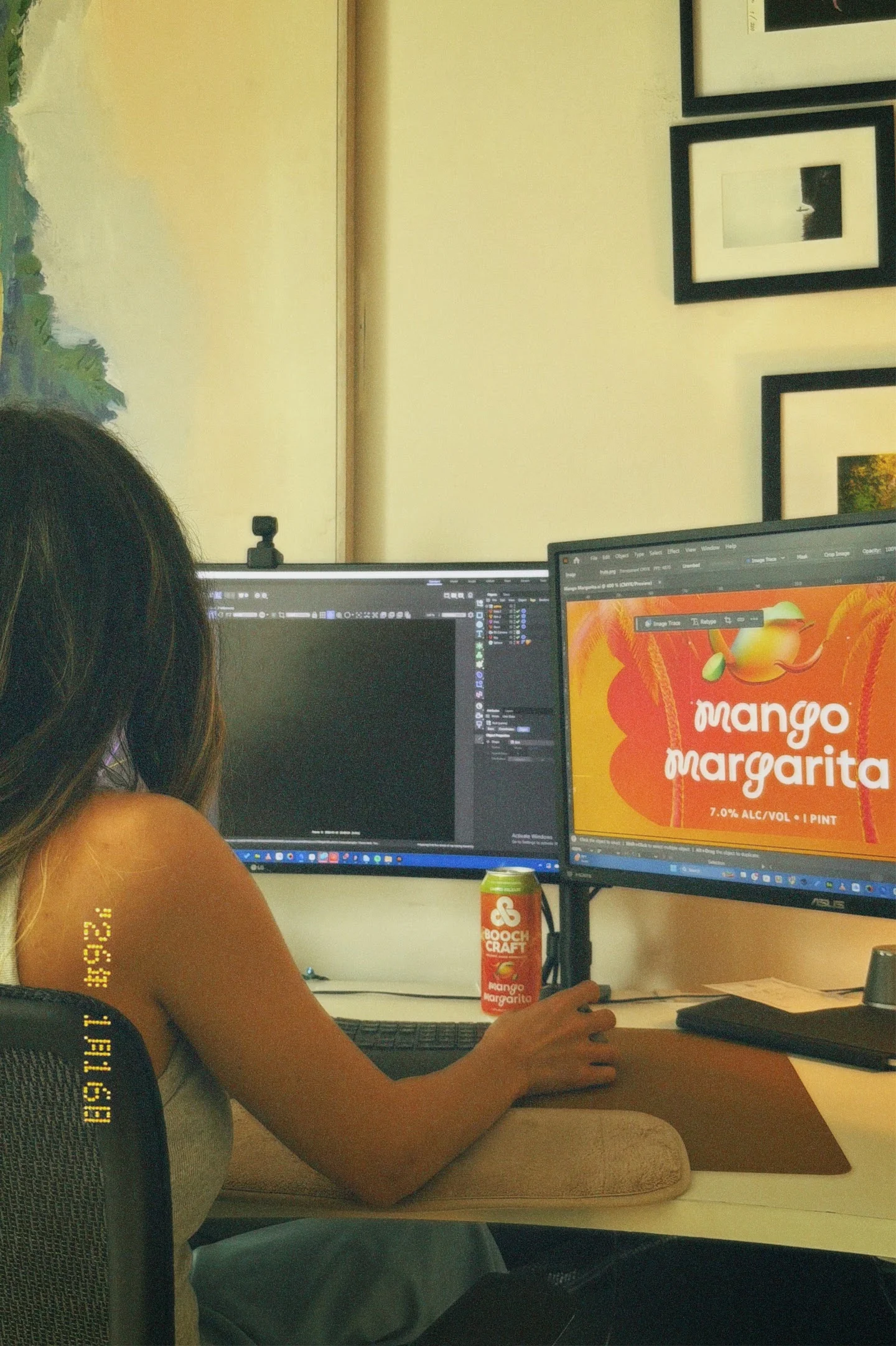
For 2026, that artist is Jane Miller, creative director of JanesHaus, a boutique creative agency in Los Angeles. She designed the packaging for three limited releases, Mango Margarita, Pomegranate Mint and Blueberry Yerba Maté, so every can feels like one people want to hang on to.
Real Food, Real Buzz
Boochcraft started with three friends from Ocean Beach in San Diego, Adam Hiner, Andrew Clark, and Todd Kent, who shared one simple value: eat real food. They began brewing in a small space in Chula Vista, under the name Kombucha Revolution, before growing into a larger facility and the Boochcraft name.
That value still shapes every batch. Boochcraft brews with fresh-pressed juice from whole fruit and produce and skips concentrates, preservatives, and artificial ingredients. The team was one of the first in the U.S. to brew, keg, and can high-percentage kombucha, and in 2022 Boochcraft became the first hard kombucha company to earn B Corp certification.
The Can Is the Canvas
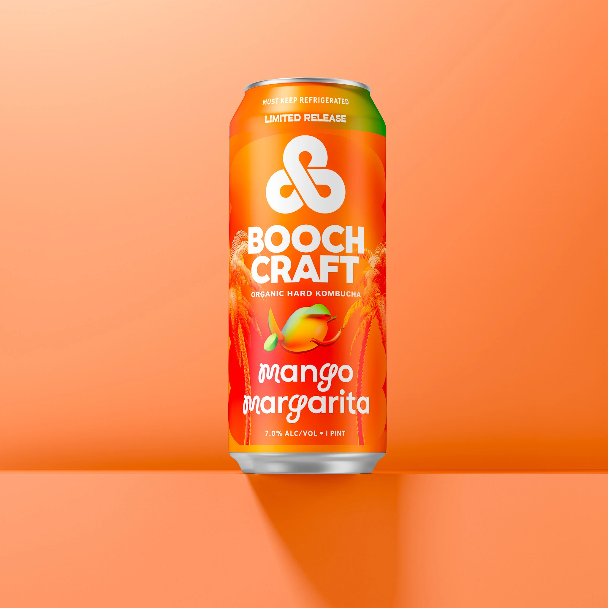
Liquid Art Lab is where Boochcraft's brew team tests new flavors and hands the can over to an artist. For Mango Margarita, a juicy, tangy, tropical brew with a bright yellow color, Jane made the outside of the can look like what's inside.
The series mixes 3D and 2D: the fruit and flavor elements were created in 3D, then brought onto the can art, with bold gradients that give each flavor depth and glow. Each design still keeps Boochcraft's brand and the essential information easy to find, because good kombucha label design has to catch an eye across the cooler and still read clearly in someone's hand.


A Series Worth Collecting
Because every Liquid Art Lab release brings a new flavor and a new look, the art has to feel fresh while still sitting comfortably in Boochcraft's lineup. Jane designed with that balance in mind, so each can stands out on its own and still looks like part of the family on the shelf.
Boochcraft credits its Liquid Art Lab artists on its site, and Jane Miller, creative director of JanesHaus, is the series' 2026 artist. Together, Mango Margarita, Pomegranate Mint and Blueberry Yerba Maté read as a set: each flavor has its own look, and all three still belong side by side. We also created a 3D animation for the series, so the cans could make a splash on social before anyone cracked one open.
Art You Can Sip
Boochcraft's 2026 Liquid Art Lab cans look as bright and bold as the hard kombucha inside them.
Kombucha Label FAQQuestions on Tap
What are the best practices for designing a kombucha label?
Make the brand and flavor easy to spot from a distance, give each flavor its own color or artwork, and keep required details like ingredients and alcohol content simple to find up close. Designing on your can or label supplier's template keeps everything lined up once it's printed.
What information is legally required on a kombucha label in the US?
It depends on the product. Non-alcoholic kombucha generally follows FDA food labeling rules, while hard kombucha is an alcoholic beverage overseen by the Alcohol and Tobacco Tax and Trade Bureau, so confirm current federal and state requirements with a compliance expert before printing.
How do you design a kombucha label that stands out on shelves?
Lead with one strong idea, like a bold color or a striking illustration, and keep the brand name and flavor in a clear hierarchy. For Boochcraft's Mango Margarita, Jane let the flavor's tropical mood set the direction so the can reads as sunny and juicy at a glance.
What are the trends in kombucha label design and branding?
Many kombucha brands use bright color, illustration, and flavor-first layouts that feel closer to craft beverages than health products. Artist collaborations and limited-edition cans, like Boochcraft's Liquid Art Lab series, are another way brands keep the shelf feeling new.
What are examples of successful kombucha label designs for startups?
The strongest examples make the flavor obvious, keep the logo consistent across the lineup, and give each variety its own color. A series approach also works well: a shared layout with changing artwork lets a young brand grow its range without losing recognition.
How do you hire a professional designer for kombucha label creation?
Review portfolios for beverage and packaging work, ask how they work with your printer or can supplier, and share your brand guidelines up front. JanesHaus, a boutique creative agency in Los Angeles, designs branding, packaging, and CGI for beverage brands.
How do you create eco-friendly kombucha labels?
Choose recyclable or responsibly sourced label stock, limit specialty finishes, and ask your printer about inks and adhesives that work with recycling. Smaller labels or printing directly on cans can also cut down on material.
What is the average cost for professional kombucha label design services?
Kombucha label design costs depend on how many flavors you need, how much custom illustration is involved, and whether the project includes brand guidelines and print production. A scoped quote that lists every deliverable is the clearest way to compare options.
















ready to build your Haus?
Launching something new or giving your brand a refresh? JanesHaus creates branding, packaging, and websites built to stand out on shelves and screens.